Traumatic Brain Injury and Depression: A Survival Analysis Study in R (Part 7)

February 17, 2025
Research
Tutorials
Introduction
Welcome back to our hands-on series on survival analysis! We've prepared our data, and now we're ready to embark on the exciting phase of data exploration and visualization. But before we can dive into the insights, we need to ensure our R environment is properly configured and our workflow is optimized for clarity, reproducibility, and visual impact.
Our ultimate goal remains the same: to answer the critical question of how depression levels one year after a traumatic brain injury (TBI) influence all-cause mortality within the subsequent five years. The steps we take in this post will bring us closer to uncovering data-driven insights that could ultimately lead to better interventions and improved patient outcomes.
In this post, we'll focus on building a strong foundation for our analysis by covering the following key steps:
4.1 Initial Setup and Library Loading
We'll streamline our R environment by loading essential libraries for data manipulation, visualization, and reporting. We'll also create a well-structured directory system to keep our project organized and our results reproducible.
4.2 Crafting a Custom Theme
We'll define a custom visual theme using ggplot2 to ensure that all of our plots have a consistent, professional, and polished look. This will enhance the clarity and impact of our visualizations.
4.3 Visualizing Univariate and Bivariate Relationships
We'll use our complete-case sample to generate a series of insightful plots, including bar plots and ridgeline plots. These visualizations will help us explore the relationships between key variables like depression, age, and survival outcomes.
4.4 Interpreting Univariate and Bivariate Relationships
We'll go beyond simply creating plots; we'll delve into their interpretation, extracting key insights and discussing how these findings will inform our subsequent survival modeling.
Why This Matters: From Technical Details to Meaningful Discoveries
These preparatory steps might seem technical, but they are the bedrock of a reliable and impactful analysis. Here's why they are so important:
Reproducibility: A well-defined and documented setup ensures that our analysis can be easily replicated and validated by others—a cornerstone of scientific integrity.
Efficiency and Clarity: A structured workflow, with organized directories and clearly labeled variables, saves time, reduces errors, and makes our analysis easier to follow.
Visual Impact: Carefully crafted visualizations, guided by a consistent theme, enhance the communication of our findings, making complex patterns accessible to a wider audience.
Foundation for Insights: The exploratory visualizations that we create will provide a crucial bridge between our raw data and the more sophisticated survival models that we'll build later. They allow us to generate hypotheses, identify potential confounders, and refine our understanding of the data's underlying narrative.
Throughout this post, we'll provide detailed R code examples with clear, jargon-free explanations. Whether you're a seasoned data analyst or just beginning your exploration of survival analysis, you'll find practical techniques and valuable insights that you can apply to your own projects.
Let's get started! By investing in these foundational steps, we're setting the stage for uncovering meaningful patterns and ultimately answering critical questions about the long-term impact of depression on survival after TBI.
4.1 Initial Setup and Library Loading
Introduction
This script establishes the foundational environment for data analysis by loading essential R libraries, setting up a structured directory system for data management, loading preprocessed data, and configuring plot aesthetics. These steps ensure a reproducible, organized, and visually consistent workflow, allowing us to effectively explore the relationship between depression one year post-TBI and five-year all-cause mortality. We will then use this foundation to delve into descriptive statistics visualizations in the subsequent sections of this blog post.
Step 1: Equipping Ourselves - Loading Essential Libraries
Before we can start exploring our data, we need to ensure that we have the right tools at our disposal. We'll load a curated set of R libraries, each chosen for its specific role in data analysis, visualization, or reporting.
Let's break down what's happening:
pacman: Our Package Manager:The
pacmanpackage simplifies the process of managing R packages. The code first checks ifpacmanis installed, and if not, it installs it.Why It Matters:
pacmanstreamlines our workflow by allowing us to install and load multiple packages with a single command (p_load). It also handles situations where a package is already installed, preventing unnecessary re-installations.
Our Arsenal of Libraries:
extrafont: This package allows us to customize our plots and tables with specific fonts, giving our work a polished and professional look.ggrides: This package is our tool for creating visually appealing ridge plots, which are particularly useful for visualizing the distributions of continuous variables across different categories.here: This package is essential for creating reproducible file paths. It automatically detects the project's root directory, making our code portable across different computer environments.tidyverse: This is a collection of essential R packages for data science, includingdplyr(for data manipulation),ggplot2(for data visualization), and many others. Thetidyverseprovides a cohesive and powerful framework for working with data in R.
Pro Tip: Using pacman::p_load is a a best practice for managing package dependencies. It ensures that all required libraries are installed and loaded efficiently, saving you time and preventing potential errors.
Step 2: Building Our Home Base - Creating a Project Directory
A well-organized project directory is essential for keeping our files in order, ensuring reproducibility, and making collaboration easier. Let's create a clear structure for our project:
What's happening here?
Defining Directories:
Data/Processed: This directory will house our preprocessed datasets, keeping them separate from the raw data.Output/Plots/Univariate_and_Bivariate_Plots: This directory will store the plots we create to explore our variables, both individually and in relation to each other.
Automating Directory Creation:
here(): This function from theherepackage dynamically defines file paths relative to the project's root directory. This makes our code more portable, as it will work correctly even if the project is moved to a different location.dir.create(): This function creates the specified directories. Therecursive = TRUEargument ensures that any necessary parent directories are also created. Theif (!dir.exists(…))checks prevent these directories from being recreated if they already exist.
Why It Matters
This structured approach eliminates confusion about file locations, ensures that outputs and intermediate datasets are systematically organized, and promotes reproducibility.
Step 3: Loading Our Preprocessed Data
Now that our environment is set up, let's load the preprocessed datasets that we've prepared in previous steps:
What's happening here?
readRDS(): This function loads R objects that was previously saved as.rdsfiles. We're loading:analytic_data_imputed: A version of our primary dataset that includes imputed values for some variables with missing data. We will use this dataset later in this blog series.analytic_data_final: Our main dataset, which has undergone cleaning, transformation, and eligibility criteria application.complete_cases_all: A dataset containing only complete cases.complete_cases_select: A dataset containing only complete cases for the selected set of covariates.
Why It Matters
These datasets are the result of our careful preprocessing efforts. They are now ready for the next stages of our analysis: descriptive exploration and visualization.
Using
.rdsfiles is an efficient way to store and retrieve R objects, preserving all data structures, including factor levels, labels, and metadata.
Step 4: Polishing Our Tables and Plots - Configuring Aesthetics
To ensure that our tables and visualizations effectively communicate our findings, let's import some custom fonts:
What's happening here?
extrafont: This package allows us to use fonts beyond the standard R defaults.loadfonts(): This function imports fonts installed on your system, making them available for use in R.
Why It Matters
Consistent aesthetics and enhanced readability make our tables and visualizations more professional and impactful.
Pro Tip: If you are sharing code with others, it is best to specify a font that is commonly available across systems to avoid any font-related errors.
The Big Picture: A Foundation for Discovery
These initial setup steps are more than just technicalities; they establish a reproducible workflow, ensure that our project is well-organized, and equip us with the tools needed to handle complex datasets and analyses.
Looking Ahead: Exploring and Visualizing Our Data
With our R environment configured and our datasets loaded, we're now ready to continue the exciting phase of exploratory data analysis. In the next sections, we will:
Create insightful data visualizations to further explore our data.
Each step builds upon this foundation, paving the way for survival models that will address our central research question.
4.2 Crafting a Custom Theme
Introduction
As we prepare to visualize our data, it's important to think about the aesthetics of our plots. A consistent and well-designed visual style is not just about making things look pretty; it plays a crucial role in how effectively our visualizations communicate insights to our audience.
In this section, we'll define a custom theme using the ggplot2 package. Think of this as creating a visual template for our plots, ensuring that they are polished, consistent, and easy to interpret. This theme will be particularly important as we move into creating univariate plots (like histograms and bar plots) and bivariate plots (like scatter plots and box plots) to explore our data.
Why Bother with a Custom Theme?
You might be asking, "Why is a custom theme so important?" Here's the breakdown:
Clarity and Readability: A well-designed theme, with clear labels, readable fonts, and thoughtful spacing, makes it easier for viewers to quickly grasp the key information presented in a plot.
Professionalism and Consistency: Applying a consistent them across all of our visualizations gives our work a polished and professional look, making it more credible and impactful. It also helps to visually unify our work, creating a cohesive narrative across our analyses.
Accessibility: A clean and well-designed visual style can make our plots more accessible to a wider audience, including those who may not be familiar with the technical details of our analysis.
Step 1: Defining a Custom Theme - The customization Object
Let's create our custom theme object, which we'll call customization. This object will store all of our aesthetic preferences, making it easy to apply them to our plots.
What's happening here?
We're using the theme() function from ggplot2 to define various aspects of our plot's appearance:
Font Choice:
family = "Proxima Nova": We've selected "Proxima Nova" as our primary font. It's a modern, clean, and highly readable sans-serif font. If this font is not available on your system, you can substitute it with a similar font like "Arial" or "Helvetica."
Title Styling:
title = element_text(…): We're making our plot titles bold and setting their font size to 20, ensuring they stand out and are easily noticed.
Axis Labels:
axis.title.x = element_text(…)andaxis.title.y = element_text(…): We're making our x- and y-axis labels bold with a font size of 12. We've also added margins (margin(t = 10)andmargin(r = 10)for the y-axis) to create some space between the labels and the axis lines, improving readability.
Axis Text:
axis_text = element_text(…): We're setting the font size of the tick labels on our axes to 10, ensuring they are legible but not overwhelming.
Legend Formatting:
legend.title = element_text(…): We're making the legend title bold with a font size of 10 to distinguish it from the rest of the legend text.legend.text = element_text(…): We're setting the font size of the legend text to 9.5 for better readability.legend.position = "top": We're placing the legend at the top of the plot. This is often a good choice for plots with many elements, as it helps avoid visual clutter and ensures the legend doesn't obscure important data points.
Applying Our Theme to Visualizations
This customization theme will be our visual foundation, applied to all plots throughout this project. For instance, when creating a bar plot, we can simply add + customization to our ggplot code:
This will automatically apply all the aesthetic settings we defined in our customization theme, ensuring a consistent and professional look across all of our visualizations.
Pro Tip: Saving and Reusing Your Theme
To make your custom theme even more useful, you can save it as an R object and reuse it in future projects. Here's how:
This allows you to maintain a consistent visual style across all of your analyses without having to redefine the theme each time.
Looking Ahead: Bringing Our Data to Life with Visualizations
With our custom theme defined, we've set the stage for creating impactful visualizations that effectively communicate our findings. In the next sections, we'll start generating univariate and bivariate plots to explore the relationships between depression levels, demographic factors, and survival outcomes.
We'll see how our custom theme enhances the clarity and professionalism of these plots, making them powerful tools for understanding our data. Stay tuned as we continue our journey, transforming data into a compelling visual narrative!
4.3 Visualizing Univariate and Bivariate Relationships
Introduction
We've meticulously prepared our data, and now comes the exciting part: visualizing the relationships within it. Before we build our complex survival models, creating univariate (one variable) and bivariate (two variables) visualizations allows us to explore our data, identify patterns, and form initial hypotheses. These visual explorations are critical for understanding the interplay between our variables and will guide our subsequent modeling choices.
In this section, we'll focus on creating insightful plots that illuminate key aspects of our data, specifically focusing on how depression levels at Year 1 relate to other variables in our complete-case sample.
Example 1: Counts of Censored vs. Expired Participants by Depression Level at Year 1
Rationale: Our primary interest lies in understanding how depression at Year 1 might influence survival. This first visualization helps us examine the distribution of survival outcomes (event_status, which indicates whether a participant was censored or died), across different depression levels.
Key Steps
Data Preparation:
vital_status_by_depression_data <- complete_cases_select |> drop_na(event_status): We create a new data frame calledvital_status_by_depression_databy taking thecomplete_cases_selectdataset and removing rows with missing values forevent_statususingdrop_na(). Since this dataset has already been filtered to include only complete cases, we do not expect any missing values in this variable. However, it is good practice to include this step in case there are any unexpected missing values.count_data_vital_status <- vital_status_by_depression_data |> count(depression_level_at_year_1, event_status): We then create another data frame calledcount_data_vital_statusthat counts the number of participants for each combination ofdepression_level_at_year_1andevent_status. This is the data that will be used to create the bar plot.
Visualization:
ggplot(…): We initiate a plot usingggplot2, mappingdepression_level_at_year_1to the x-axis andevent_statusto the fill color.geom_bar(…): We create a bar plot withposition = position_dodge()to place bars for each vital status side-by-side for each depression level.stat = "count"ensures that the height of the bars represents the count of observations. We also make aesthetic adjustments by changing thecolorandlinewidthof the bars.scale_fill_manual(...): We define custom colors for the "Censored" (light gray) and "Expired" (dark gray) categories and provide labels for each category.geom_text(…): We add text labels to the bars, displaying the exact counts within each bar for better readability. They = n/2argument, along withposition = position_dodge(width = 0.9)places the labels in the center of each bar. We also make aesthetic adjustments by changing the fontfamily,fontface,size, andcolorof the text labels.labs(…): We add clear labels for the x and y axes and the legend title.scale_y_continuous(…): We format the y-axis to include commas in the tick labels (e.g., 1,000 instead of 1000) and set the axis breaks.theme_classic(): We apply a clean, classic theme to the plot.customization: We apply our previously defined custom theme for a consistent look and feel.theme(…): We make final adjustments to the legend, justifying it to the right.
Interpretation
This plot visually depicts the number of censored and expired participants within each depression level category. We can then visually assess whether there are notable differences in the distribution of survival outcomes across depression levels. For instance, are participants with major depression more likely to have expired during the study period compared to those with no or minor depression?
Saving the Plot
We can save this plot as a .png file using the following code:
Why This Visualization Matters
This bar plot, displaying the counts of censored and expired participants for each depression level, is more than just a simple visualization. It provides our first crucial glimpse into the potential relationship between depression at Year 1 and mortality in our complete-case sample. Here's why it's so important:
Direct Comparison of Outcomes: The plot allows us to directly compare, visually, the number of participants who expired versus those who were censored within each depression level. This provides a preliminary sense of whether mortality rates might differ across these groups in the complete-case sample.
Highlights Potential Trends: While not a formal statistical test, the visualization can highlight potential trends that warrant further investigation. For example, if the proportion of dark gray bars (expired) is noticeably higher in the "Major Depression" group compared to the "No Depression" group, it suggests a possible association between depression and mortality that we'll need to explore with our survival models.
Informs Subsequent Analyses: The patterns observed in this plot can inform our choices in the subsequent modeling steps. For example, if we see large differences in mortality counts between depression levels, it reinforces the importance of including depression as a predictor in our Cox regression models.
Communicates Findings: The bar plot provides a clear and intuitive way to communicate the distribution of survival outcomes across depression levels to a broad audience, including those who may not be familiar with the intricacies of survival analysis. It serves as an accessible entry point for understanding the core relationship that we're investigating.
Provides an Initial Look at the Data: This plot is based on the participants that had complete data for the variables of interest. Comparing the results of this plot to our initial hypotheses based on prior research can help us determine how to proceed with our analyses.
Limitations
It's essential to remember that this plot is based on raw counts and does not account for differences in follow-up time between participants, nor does it adjust for other factors that might influence survival. Therefore, we can't draw definitive conclusions about the causal relationship between depression and mortality from this plot alone. It is important to note that this plot is based on the complete-case sample, so the findings should be interpreted with caution.
In essence, this bar plot serves as a crucial first step in our exploration of the data. It provides a visual summary of the relationship between depression and survival outcomes in our complete-case sample, guiding our subsequent analyses and setting the stage for more sophisticated survival modeling.
Example 2: Percentages of Censored vs. Expired Participants by Age Group
Rationale: Age is a well-established predictor of mortality, and exploring its relationship with survival outcomes in the context of depression after TBI is crucial. By examining the percentages of expired participants within specific age groups and depression levels, we can identify potential interactions and vulnerable subgroups. For instance, does the impact of depression on mortality differ between younger and older adults?
Step-by-Step Explanation
Data Preparation:
Creating Age Groups (
age_group):complete_cases_select <- complete_cases_select |> ...: We start by modifying ourcomplete_cases_selectdata frame.mutate(age_at_injury = as.numeric(as.character(age_at_injury)), ...): We ensure that theage_at_injuryvariable is treated as numeric. We first convert it to a character vector before converting it to numeric to account for the possibility that it was originally stored as a factor variable with underlying numeric codes.age_group = cut(age_at_injury, ...): We create a new variable calledage_groupby dividing theage_at_injuryvariable into 10-year age intervals using thecut()function.breaks = seq(16, 96, by = 10): We define the age group boundaries (16-25, 26-35, etc.).right = FALSE: We specify that the intervals should be left-closed (e.g., [16, 26), [26, 36), etc.), meaning that a value of 26 would fall into the 26-35 group.include.lowest = TRUE: We ensure that the lowest age value (16) is included in the first interval.labels = …: We create descriptive labels for each age group (e.g., "16-25", "26-35").
Calculating Percentages:
mortality_plot_pct_data <- complete_cases_select |> ...: We create a new data frame calledmortality_plot_pct_datato store the data for our plot.drop_na(event_status): We remove any rows with missing values forevent_status.count(age_group, event_status): We count the number of participants in each combination ofage_groupandevent_status.group_by(age_group): We group the data byage_group.mutate(pct = n / sum(n) * 100): We calculate the percentage of participants within eachage_groupthat have eachevent_status(censored or expired).
Visualization with
ggplot2:ggplot(…): We initiate aggplotobject, mappingage_groupto the x-axis, percentage (pct) to the y-axis, andevent_statusto the fill color of the bars.geom_bar(…): We create a bar plot usinggeom_bar().stat = "identity": We usestat = "identity"because we've already calculated the percentages we want to display.position = position_dodge(): This places the bars for "Censored" and "Expired" side-by-side within each age group, making comparisons easier. We also adjust the color and line width of the bars.
scale_fill_manual(…): We define custom colors for the "Censored" (light gray) and "Expired" (dark gray) bars.geom_text(…): We add text labels to the bars, displaying the exact percentages, formatted to one decimal place. Thecolorargument specifies different colors for the text labels to ensure they are visible against the bar colors.scale_y_continuous(…): We add a "%" sign to the y-axis tick labels and set breaks at every 20%.labs(…): We provide clear and informative labels for the x-axis, y-axis, and legend.theme_classic(): We apply a simple, classic theme for a clean look.customization: We apply our previously defined custom theme (customization) to ensure consistency across all of our plots.theme(…): We make additional adjustments to the legend, placing it on the right side of the plot.
Saving the Plot:
ggsave(…): We save the plot as a high-resolution.pngfile, making it easy to include in reports or presentations. We adjust the dimensions of the saved plot to ensure that all text labels are legible.
Interpretation:
This plot will allow us to visually compare the percentages of expired participants across different age groups. By examining the height of the dark gray bars ("Expired") within each age group, we can start to identify potential associations between age and mortality in our complete-case sample. For example, we might observe that:
The percentage of expired participants generally increases with age, which would align with general population trends.
Certain age groups have particularly high or low mortality rates, which could warrant further investigation.
Why This Visualization Matters
Reveals Age-Related Patterns: This plot helps us explore the relationship between age and mortality, providing insights that might not be apparent from the descriptive statistics tables alone.
Guides Model-Building: The observed patterns can inform our decisions about how to incorporate age in our survival models (e.g., whether to treat it as a linear or non-linear predictor).
Communicates Findings: The visualization provides a clear and intuitive way to communicate the age distribution of mortality in our sample.
Example 3: Distribution of Age at Expiration by Depression Level
In our ongoing exploration of the TBIMS dataset, we're using visualizations to uncover patterns and relationships that might shed light on the factors influencing survival after traumatic brain injury (TBI). In this section, we'll shift our focus from the age at injury to the age at death (which we are calling age_at_expiration), a variable more directly connected to our outcome of interest.
We'll use a ridgeline plot to visualize the distributions of age_at_expiration across different levels of depression at Year 1, allowing us to compare the age at which participants with varying degrees of depression died during the study period. This visualization, created for our complete-case sample, will provide valuable insights into the potential interplay between depression, age, and mortality.
Rationale: Understanding the distributions of age at death across different depression levels can reveal important patterns. For instance, are participants with major depression dying at younger ages compared to those with no or minor depression? Does the spread or shape of the age-at-death distribution differ across depression groups? This visualization helps us answer such questions and guides our subsequent survival modeling.
Let's dissect the R code used to create this ridgeline plot:
Data Preparation:
complete_cases_select <- complete_cases_select |> left_join(analytic_data_final |> select(id, age_at_expiration), by = "id"): We first ensure that theage_at_expirationvariable is available in ourcomplete_cases_selectdataset by performing aleft_joinwithanalytic_data_final, matching by participantid.
Visualization with
ggplot2andggridges:ggplot(complete_cases_select, aes(…)): We initiate aggplotobject, using ourcomplete_cases_selectdata frame.aes(x = age_at_expiration, y = depression_level_at_year_1, fill = depression_level_at_year_1, color = depression_level_at_year_1): We mapage_at_expirationto the x-axis,depression_level_at_year_1to the y-axis, and also usedepression_level_at_year_1to define the fill color and outline color of the density ridges.geom_density_ridges(linetype = 1, linewidth = 0.75): This is where the magic happens. We use thegeom_density_ridgesfunction from theggridgespackage to create the ridgeline plot. This type of plot is ideal for visualizing and comparing distributions across different categories. We also make aesthetic adjustments to the plot by modifying thelinetypeandlinewidtharguments.scale_fill_manual(…)andscale_color_manual(…): We define custom colors for the fill and outline of the density ridges, using distinct shades for each depression level to improve visual clarity.labs(…): We provide clear and informative labels for the x-axis, y-axis, and legend title.scale_x_continuous(breaks = seq(15, 100, by = 10)): We set the breaks on the x-axis to occur every 10 years.theme_ridges(): We apply a theme specifically designed for ridgeline plots.customization: We apply our previously defined custom theme to ensure consistency across all of our visualizations.theme(…): We make further adjustments, such as centering the axis titles and modifying the plot's background color. We also move the legend to the right of the plot.
Saving the Plot:
ggsave(…): We save the plot as a high-resolution.pngfile with a descriptive file name in our designatedunivariate_and_bivariate_plots_dirdirectory. The dimensions are adjusted to ensure that the plot is visually appealing and all text is legible.
Interpretation
The resulting ridgeline plot (Figure 2-4) allows us to visually compare the distributions of age at death for participants in each depression level category. We can examine:
Peaks: Are there differences in the most common age at death across depression levels?
Spread: Is the age at death more variable in certain depression groups compared to others?
Skewness: Do the distributions have longer tails toward younger or older ages?
For example, we might observe that participants with major depression tend to die at younger ages compared to those with no or minor depression. Or, we might find that the age distribution at death is wider for a particular depression group, suggesting greater variability in their survival experiences.
Why This Visualization Matters
Directly Addresses Mortality: Unlike our previous plot of age at injury, this plot focuses on the age at which participants died, providing a more direct link to our outcome of interest.
Highlights Potential Differences: The ridgeline plot can reveal subtle differences in the age-at-death distributions across depression levels that might be missed by simply examining summary statistics.
Informs Modeling Choices: The observed pattern can inform how we incorporate age and depression in our survival models, potentially leading to more accurate and insightful results.
By creating this and other insightful visualizations, we're continuing to build a deeper understanding of our data. We're moving beyond simple summaries and exploring the complex relationships between our variables, setting the stage for robust survival modeling.
4.4 Interpreting Univariate and Bivariate Relationships
Introduction
We've reached a crucial point in our exploration of the TBIMS dataset: visualizing the relationship between depression at year 1 post-injury and survival outcomes. One of the first steps in this process is examining the distribution of censored and expired participants across different depression levels. This helps us understand the raw data before we move on to more complex survival models.
To do this, we created a bar plot (Figure 1-1) that displays the counts of participants in each depression category ("No Depression," "Minor Depression," "Major Depression") who were either censored (still alive at the end of their observation period) or expired (died) during the study. It is important to keep in mind that this plot is based on our complete-case sample (N = 1,549), which includes only participants with complete data on key variables.
Example 1: Figure 1-1 - Counts of Censored vs. Expired Participants by Depression Level
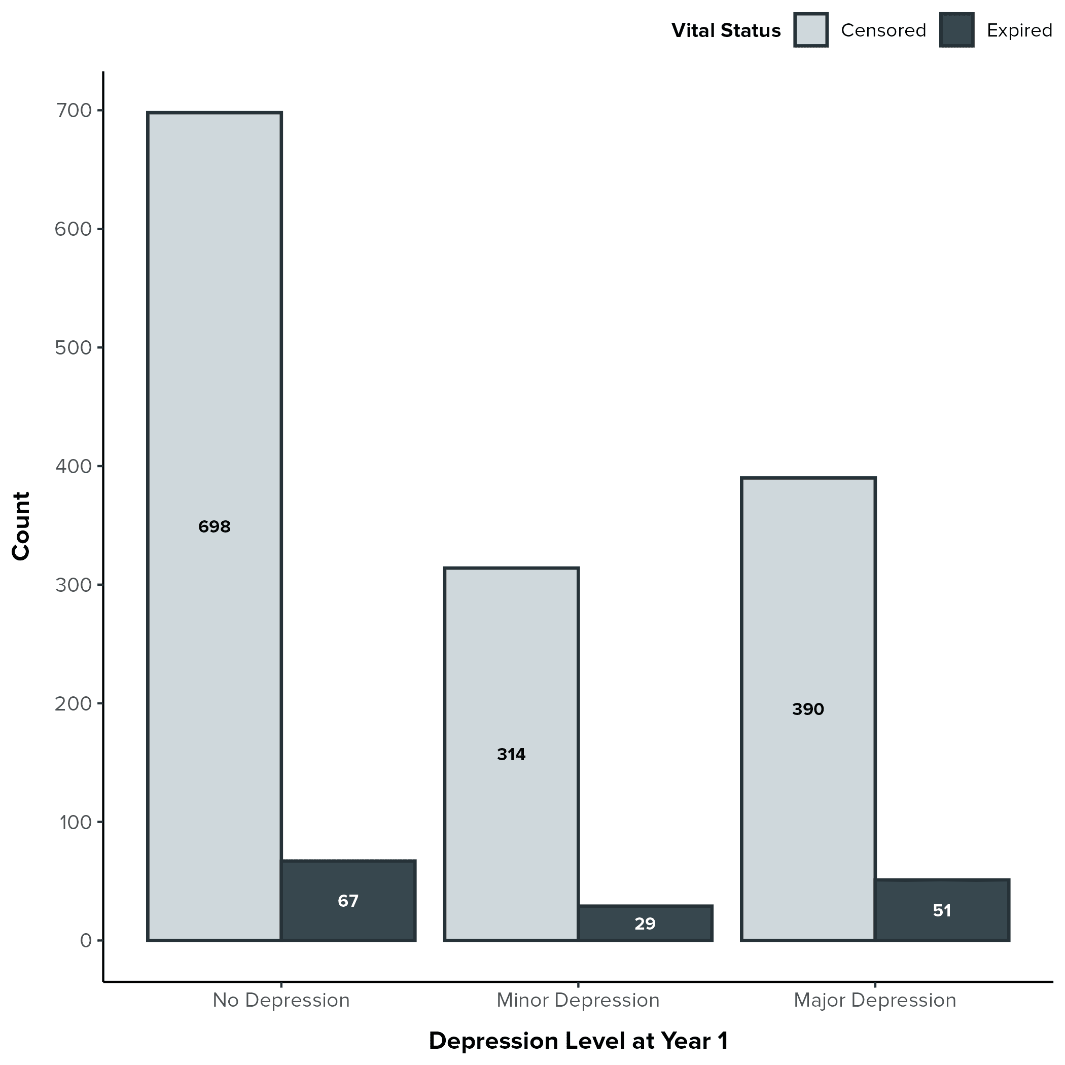
Key Observations from the Bar Plot
Censoring Dominates: A striking observation is that across all depression levels, the vast majority of participants were censored (represented by the light gray bars). This is common in survival analysis, particularly in studies with limited follow-up periods or when the event of interest (death, in this case) is relatively infrequent. It means that many participants were still alive at the end of their observation period or were lost to follow-up before the event could be observed.
Raw Counts by Depression Level:
No Depression: 698 censored, 67 expired.
Minor Depression: 314 censored, 29 expired.
Major Depression: 390 censored, 51 expired.
Visual Comparison of Proportions: While the number of expired participants is lower in the Minor Depression group, this is likely due to the smaller overall number of participants in that category. Visually, the proportion of expired participants (the dark gray bars) appears relatively similar across all three depression groups.
Interpreting the Findings
The Importance of Censoring: The high proportion of censored observations reminds us that these participants still contribute valuable information to our analysis. They were at risk of experiencing the event for the amount of time that they were observed, and this information is incorporated into survival analysis techniques like the Kaplan-Meier estimator and Cox regression.
Depression and Mortality - A Preliminary Look: Based on this visualization alone, it is difficult to discern a clear relationship between depression level at year 1 and mortality in this complete-case sample. The proportions of expired participants appear relatively similar across the depression groups. This does not rule out a relationship, but suggests that further investigation using appropriate modeling techniques is required.
Example 2: Figure 1-5 - Percentages of Censored vs. Expired Participants by Age Group
One crucial relationship to examine is between age and mortality. The bar plot we created (Figure 1-5) provides a compelling visual summary of this relationship in our complete-case sample, showing the percentages of censored (those who survived or were lost to follow-up) versus expired (those who died) participants within each age group.
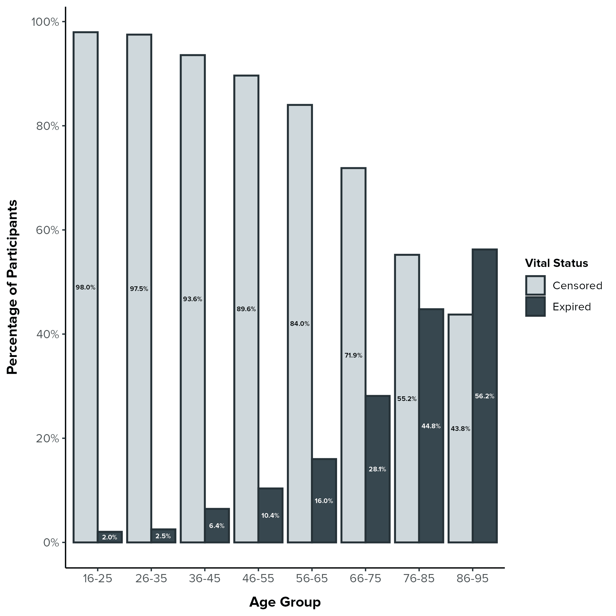
Key Observations from the Bar Plot
Increasing Mortality with Age: The most striking pattern in the plot is the clear trend of increasing mortality (represented by the dark gray bars) with advancing age. This aligns with our expectations, as age is a well-established risk factor for mortality in the general population and in many clinical contexts.
Younger Age Groups: in the younger age groups (16-25, 26-35, 36-45, 46-55), the percentage of expired participants is relatively low, hovering between 2.0% and 10.4%. The vast majority of participants in these groups were censored.
Shift in the 50s and 60s: We see a noticeable increase in mortality starting in the 56-65 age group (16.0% expired). This percentage continues to climb in the 66-75 age group (28.1% expired).
Older Age Groups: The two oldest age groups show a further increase in mortality. In the 76-85 group, 44.8% of participants had expired by the end of the observation period, and in the 86-95 group, this number rises to 56.2%.
Interpreting the Findings
This visualization provides a clear and intuitive representation of the relationship between age and mortality in our complete-case sample. The trend of increasing mortality with age is not surprising, but the plot allows us to:
Quantify the Trend: We can see the specific percentages of expired participants within each age group, providing a more precise understanding of the age-mortality relationship.
Identify Potential Thresholds: The plot suggests potential thresholds or "turning points" where mortality rates start to increase more rapidly (e.g., around ages 56-65).
Inform Model-Building: This visualization will inform how we incorporate age into our subsequent survival models. For example, we might consider modeling age as a categorical variable (using the age groups shown in the plot) or exploring non-linear relationships between age and mortality.
Important Considerations
Complete-Case Sample: This plot is based on our complete-case sample (N = 1,549), which is a subset of our full analytic sample (N = 4,283). While this visualization provides valuable insights, we need to be mindful of the potential for bias due to missing data, which we will discuss further when interpreting the results of our Cox models.
Descriptive, Not Causal: This plot is descriptive; it does not establish a causal relationship between age and mortality. Other factors (confounders) that are associated with both age and mortality could be influencing the observed pattern.
Example 3: Figure 2-4 - Distribution of Age at Expiration by Depression Level
In our ongoing exploration of the factors influencing survival after TBI, we've turned to powerful visualization techniques to illustrate the complex relationships within our data. One particularly helpful tool is the ridgeline plot, which allows us to compare the distributions of a continuous variable across different categories.
In this section, we'll focus on Figure 2-4, a ridgeline plot that displays the distributions of age at death (age at expiration) for participants in our complete-case sample, stratified by their depression level at Year 1 (No Depression, Minor Depression, Major Depression).
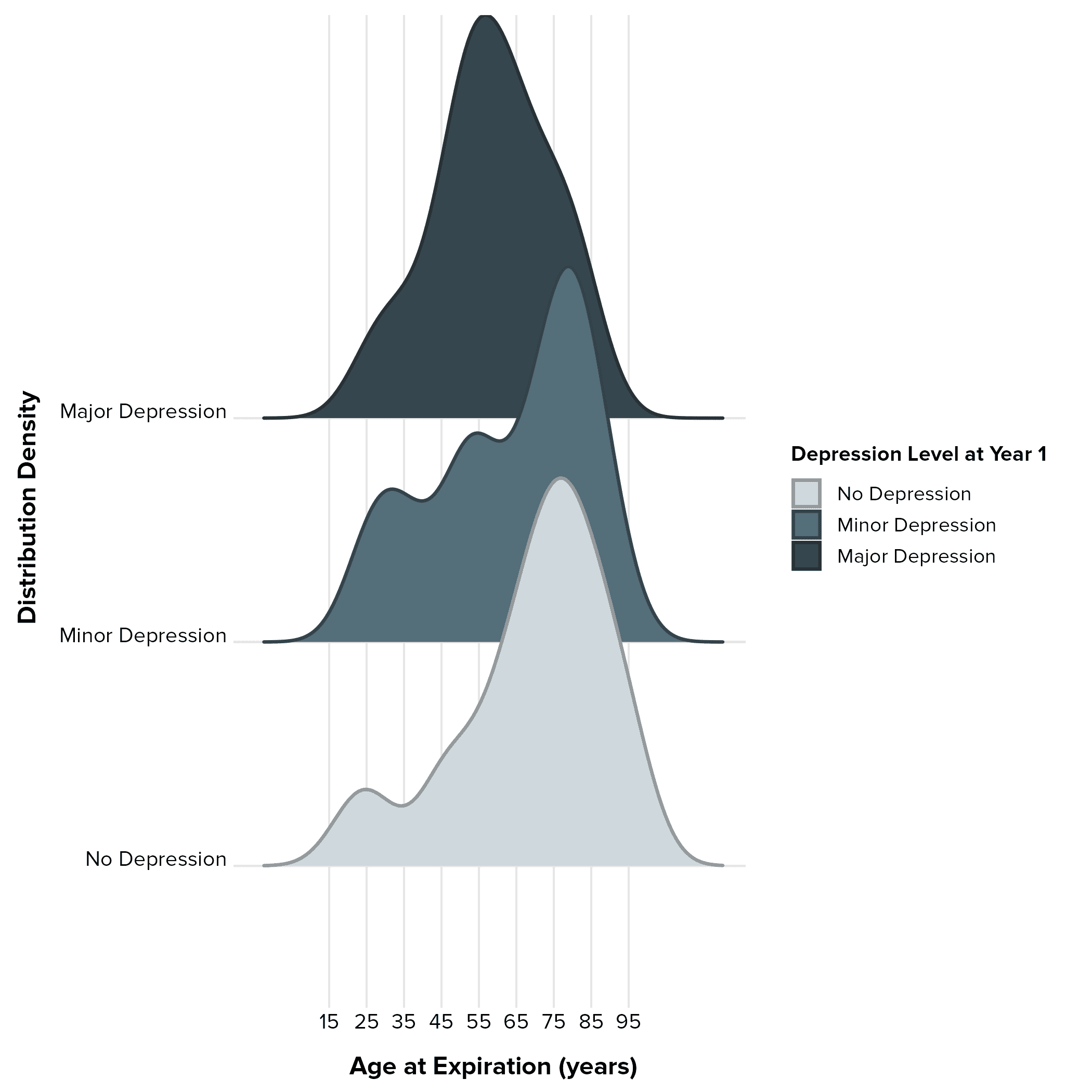
Key Observations from the Ridgeline Plot
Distinct Peaks and Shifts: One of the most striking features of the plot is the clear difference in the peaks of the age distributions across the depression levels.
No Depression: The lightest blue-gray distribution (No Depression) exhibits a peak that is furthest to the right, centered around roughly 65-75 years. This suggests that participants without depression at Year 1 tend to die at older ages compared to the other groups.
Minor Depression: The mid-blue-gray distribution (Minor Depression) shows a peak that is slightly left-shifted compared to the No Depression group, centering around 55-65 years. This indicates that participants with minor depression may tend to die at slightly younger ages.
Major Depression: The darkest blue-gray distribution (Major Depression) has a peak that is furthest to the left, around 45-55 years of age and lower than the peaks for both of the other groups. This suggests that participants with major depression tend to die at younger ages compared to those with minor or no depression.
Overlapping Distributions: While the peaks are distinct, there's a considerable degree of overlap in the age-at-death distributions across all three depression levels. This indicates that age at death varies within each group and that depression level is not the sole determinant of mortality.
Skewness:
No Depression: The distribution for this group appears to be somewhat left-skewed, with a tail extending towards younger ages, although there is a slight peak around age 25.
Minor Depression: This distribution appears more bimodal, with peaks at younger and older ages.
Major Depression: This distribution appears to be the most symmetrical and narrow, with the majority of the density centered around the peak.
Potential Implications
Depression and Mortality: The leftward shift of the peaks for the Minor and Major Depression groups suggests a potential association between depression severity at year 1 and earlier mortality. This aligns with our hypothesis that depression might negatively impact long-term survival after TBI.
Confounding or Mediation: The differences in age distributions could also suggest that age is a confounding factor, influencing both depression levels and mortality risk. Alternatively, age at injury could mediate the relationship between depression and mortality.
Informing Model-Building: This visualization underscores the importance of including age as a covariate in our survival models. The non-uniform distributions across depression levels suggest that we might need to explore non-linear relationships or interaction effects between age and depression.
Limitations
Complete-Case Sample: It's crucial to remember that these plots are based on our complete-case sample (N = 1,549), which is significantly smaller than our full analytic sample (N = 4,283). Participants with missing data on key variables (including depression level) were excluded from these analyses. This could introduce bias if the missing data are not completely random. We previously compared the complete-case sample to the full sample in our descriptive statistics tables and noted some potential differences.
Descriptive, Not Causal: These plots are descriptive visualizations. They allow us to observe patterns, but they don't provide any formal statistical tests. Further analysis, including Cox regression, is needed to formally test the relationship between depression and mortality while controlling for other factors.
Moving Forward: Beyond Counts to Survival Curves and Models
While these bar plots offer a valuable initial glimpse into our data, it's just the first step in our exploration. To gain a more comprehensive understanding of the relationship between depression and survival, we need to move beyond simple counts.
In the upcoming blog post, we will:
Visualize Survival Over Time: We'll create Kaplan-Meier survival curves to visually depict the survival probabilities over time for each depression group. This will give us a more dynamic view of survival patterns.
Build Cox Regression Models: We'll use Cox proportional hazards models to formally test the association between depression level and mortality risk, while adjusting for other important factors (confounders). This will allow us to quantify the effect of depression and determine its statistical significance.
By combining these visualizations and modeling techniques, we'll be able to draw more definitive conclusions about the impact of depression on long-term survival after TBI. We're moving closer to transforming our carefully prepared data into meaningful insights that can inform clinical practice and improve patient outcomes. Stay tuned for the next exciting steps in our survival analysis journey!
Conclusion
We've reached a thrilling milestone in our survival analysis journey! We've transitioned from data preparation to exploratory data analysis, and the insights we've gleaned are already shaping our understanding of the complex relationship between depression one year post-TBI and long-term survival. This wasn't just about generating plots and tables; it was about transforming data into a compelling narrative, setting the stage for powerful discoveries.
Reflecting on Our Progress: A Recap of Key Accomplishments
Let's take a moment to appreciate the significant progress we've made:
Building a Reproducible Workflow: We've established a robust and transparent workflow by streamlining library loading, creating a well-structured project directory, and documenting each step. This ensures that our analysis is not only efficient but also easily replicable and verifiable.
Crafting a Visual Identity: We defined a custom theme for our visualizations, ensuring that all of our plots have a consistent, polished, and professional look. This enhances the clarity and impact of our visual communication.
Unveiling Patterns Through Visualization: We brought our data to life through insightful visualizations:
Bar plots illuminated the distribution of censored and expired participants across depression levels, providing a crucial first look at survival outcomes in our complete-case sample.
Percentage plots highlighted the relationship between age and mortality, revealing important age-related trends.
Ridgeline plots revealed subtle yet meaningful differences in the distributions of age at death across depression levels, suggesting a potential link between depression and earlier mortality.
Why This Matters: Laying the Foundation for Meaningful Discovery
These exploratory steps are far more than just preliminary exercises. They are the bedrock upon which we'll build our survival models. We've accomplished the following:
Generated Data-Driven Hypotheses: The patterns we've observed in our descriptive tables and visualizations have helped us refine our hypotheses and develop a deeper understanding of the potential relationships between depression, age, and survival.
Informed Model-Building: Our exploratory findings will directly inform the choices we make when constructing our Cox regression models, such as how to include age as a predictor and whether to test for interactions between age and depression.
Enhanced Communication: Our visualizations provide a powerful and accessible way to communicate our findings to a wider audience, making complex data relationships understandable and engaging.
Looking Ahead: From Visual Insights to Statistical Models
We're now poised to transition from data exploration to the heart of our analysis: survival modeling. In the upcoming blog posts, we'll:
Visualize Survival Over Time: We'll use Kaplan-Meier curves to graphically depict survival probabilities for different depression groups, providing a dynamic view of survival patterns.
Build and Interpret Cox Models: We'll construct Cox proportional hazards models to formally test the association between depression and mortality, while adjusting for potential confounders. These models will allow us to quantify the impact of depression on survival and identify other significant risk factors.
The descriptive and visual exploration we've completed has been essential for setting the stage for these more advanced analyses. We're not just analyzing data; we're piecing together a story about the factors that influence long-term outcomes after TBI.
We're excited to continue this journey, transforming data into insights and, ultimately, contributing to a better understanding of how to improve the lives of individuals with TBI. Stay tuned for the next chapter in our survival analysis adventure!
Comments
Newer